This post is part of a series of posts to analyse the digital me.
Analyse Google Location data with R
Google is happily tracking my every move, thanks to my Android Samsung phone and poor privacy setting skills. Google collects my data about my movement through their location tracker. A lot of data!
In this blog I will explore the location data Google has collected about me since 2016.
I will be using some R packages to structure the data properly and other packages to build plots:
library(jsonlite)
library(tidyverse)
library(lubridate)
library(anytime)
library(hrbrthemes)
library(ggmap)
Get Google Location data in R
To analyse the Google Location data, we need to grab it from Google first. You can do this through Google Takeout, Google’s service to help you download all your data that they’ve collected from you in the past. Select only the Location History data and click “next” to download your file. I ended up with a pretty big json file with about 100MB of data.
I saved it to my R project folder. So now I’m good to start my analysis.
First point of action, is to load the JSON file into R and create a dataframe.
#load data
system.time(df_list <- fromJSON("dfs/Locatiegeschiedenis.json"))
df <- df_list$location
head(df)
I want to clean up the dataframe a bit, to make sure I can use it for my analysis and plots. I will also create a few new columns to make life easier.
#create columns for dates
as.POSIXct(as.numeric(df$timestampMs)/1000, tz='GMT', origin='1970-01-01') -> df$time
as.Date(df$time) -> df$date
isoweek(df$date) -> df$week
isoyear(df$date) -> df$year

#Create proper lat lon columns for ggmap
df$lat <- df$latitudeE7 / 1e7
df$lon <- df$longitudeE7 / 1e7
Some summary data
Now let’s have a quick look at the dataset.
#return some summary data
n_count <- nrow(df) #number of rows in dataframe / number of location pings
n_count
n_days <- df$date %>%
  n_distinct() #number of days in dataframe
n_days
n_avg_day <- round(n_count/n_days,2) #average number of datapoints per day
n_avg_day
round(n_avg_day / 24,2) #average number of datapoints per hour
Looking at this data, I was kind of surprised by the amount of data Google is collecting. Almost a datapoint per 2 minutes, for days when they were collecting data!
Number of datapoints per month
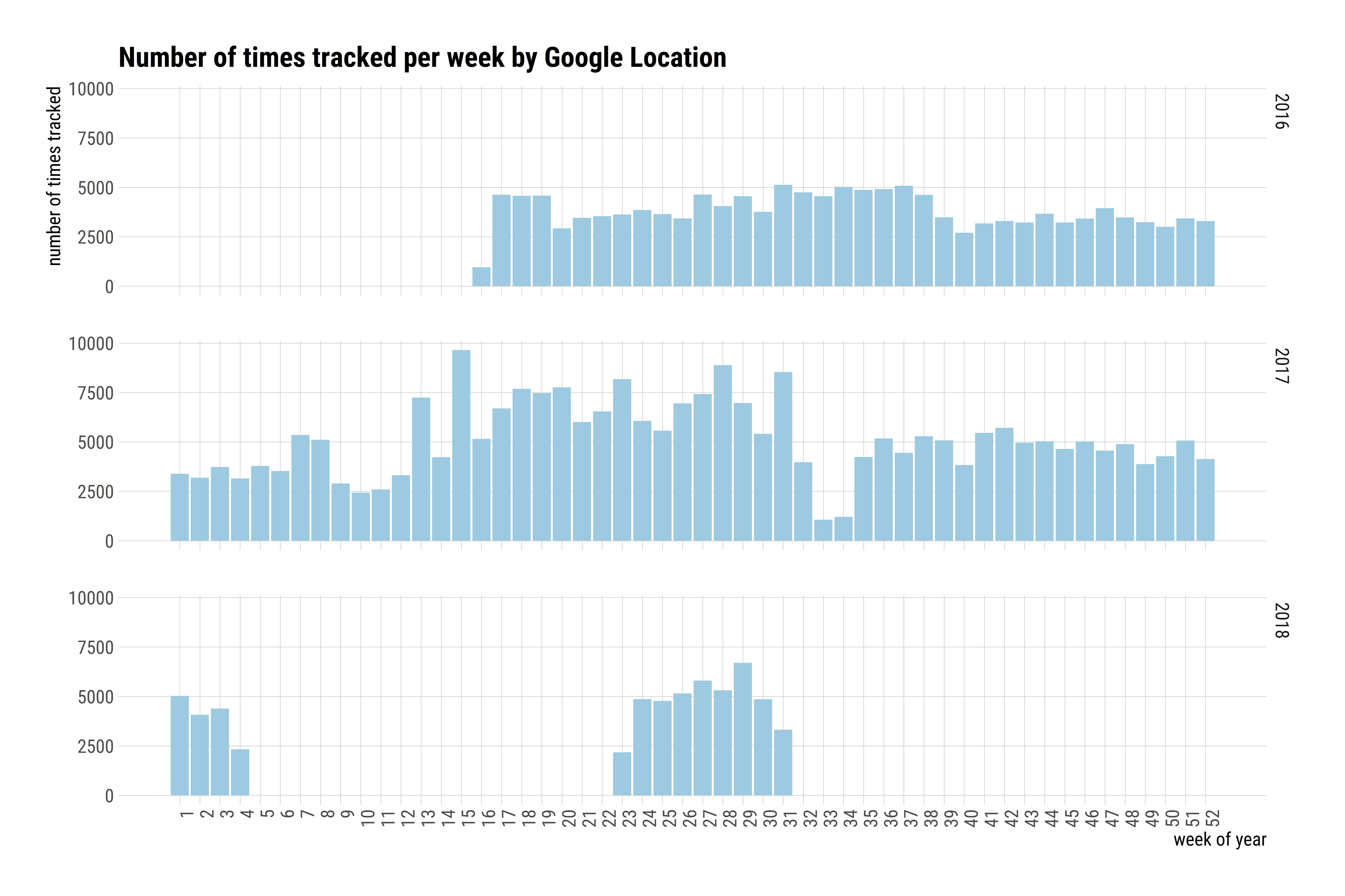
It’s time to visualise some of the data I’ve got in the dataframe. A first view will be of the number of datapoints per week. I will be using the Tidyverse package, together with hrbrthemes, to create some easy-to-read plots.
#colors for fill and lines in ggplot
col1 = "#9ecae1" #light blue

#The actual weekly data plot
df %>%
  group_by(week,year) %>%
  summarise(n = n()) %>%
  ggplot( aes(x=week, y = n)) +
  geom_bar(stat= "identity",fill=col1) +
  facet_grid(facets = year ~ .) +
  theme_ipsum_rc(grid="XY", axis_text_size=12, axis_title_size = 12)+
  theme(axis.text.x = element_text(angle = 90, hjust = 1))+
  scale_x_continuous(breaks = c(1:52)) +
  labs(x = "week of year", y = "number of times tracked", title="Number of times tracked per week by Google Location")
Weekly datapoints
As you can see, Google has been collecting data since mid-2016, with a gap in 2018. I disabled Google Location tracking during that time. Unfortunately, some of my favorite apps seem to depend on it, so I had to turn it back on again. At its peak, Google was collecting almost 100.000 datapoint a week in 2017. It also seems like I may not be very active in the last few months of the year, since fewer datapoints are required to pinpoint my location.
Activities in Google Location
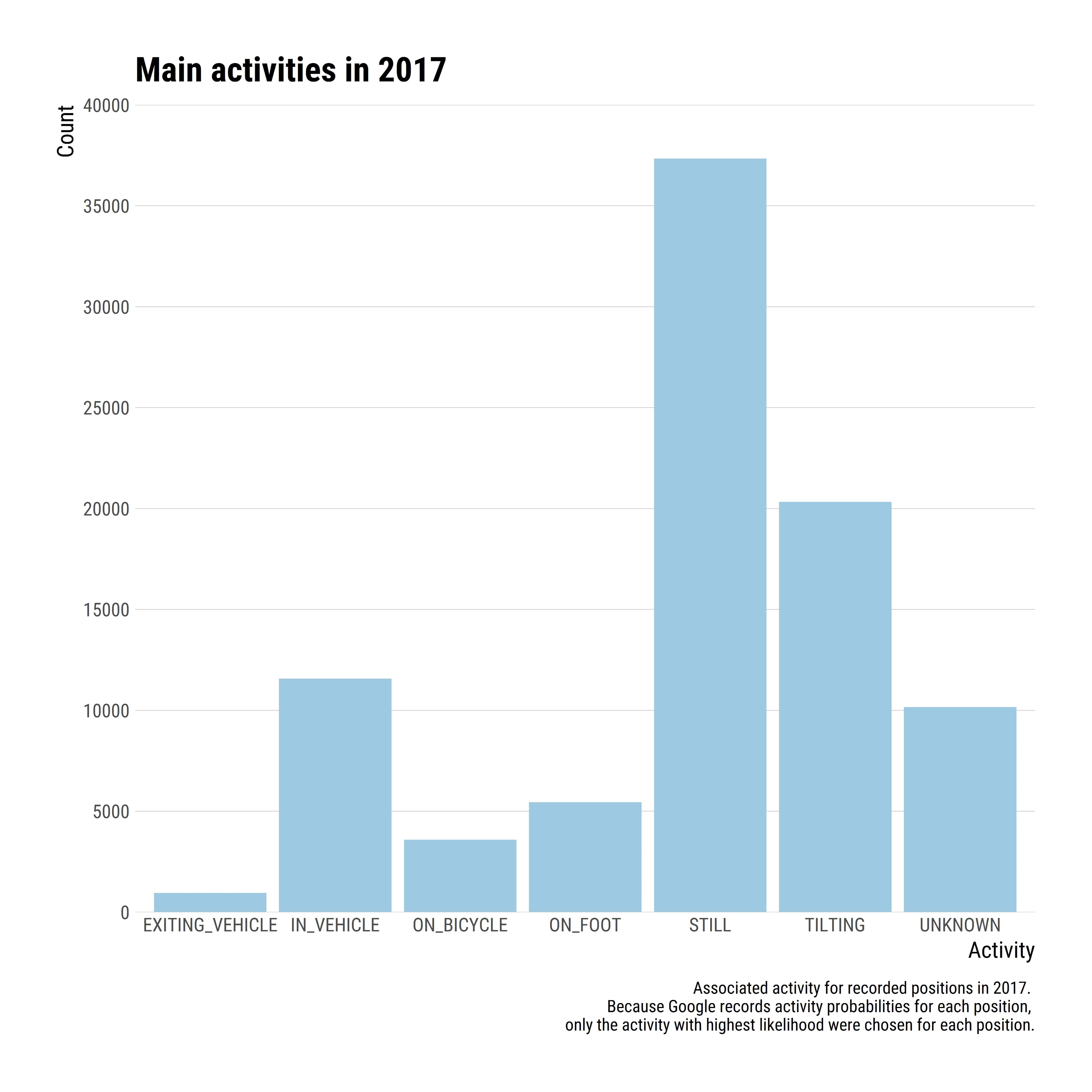
As you could see in the dataframe, Google also includes data about the activity I am doing, for each datapoint. They are often set to NULL, but let’s see what Google can tell me about my activity. Because this is such a big dataset, I’m going to limit this visualisation to 2017 and only show the first available activity for each datapoint / row.
loc3 <- with(df, subset(df, df$time > as.POSIXct('2017-01-01 0:00:01')))
loc3 <- with(df, subset(loc3, df$time < as.POSIXct('2017-12-31 23:59:59')))
activities <- loc3$activity

list.condition <- sapply(activities, function(x) !is.null(x[[1]]))
activities  <- activities[list.condition]

df3 <- do.call("bind_rows", activities)
main_activity <- sapply(df3$activity, function(x) x[[1]][1][[1]][1])
activities_2 <- data.frame(main_activity = main_activity,
                           time = as.POSIXct(as.numeric(df3$timestampMs)/1000, origin = "1970-01-01"))
ggplot(activities_2, aes(x = main_activity, group = main_activity)) +
  geom_bar(fill=col1)  +
  guides(fill = FALSE) +
  scale_y_continuous(breaks= scales::pretty_breaks(n=6),expand=c(0,0), limits=c(0, 40000)) +
  theme_ipsum_rc(grid="Y", axis_text_size=10, axis_title_size = 12)+
  labs(
    x = "Activity",
    y = "Count",
    title = "Main activities in 2017",
    caption = "Associated activity for recorded positions in 2017.
    Because Google records activity probabilities for each position,
    only the activity with highest likelihood were chosen for each position."
  )
Main activities in 2017
Locations from the Google Location data
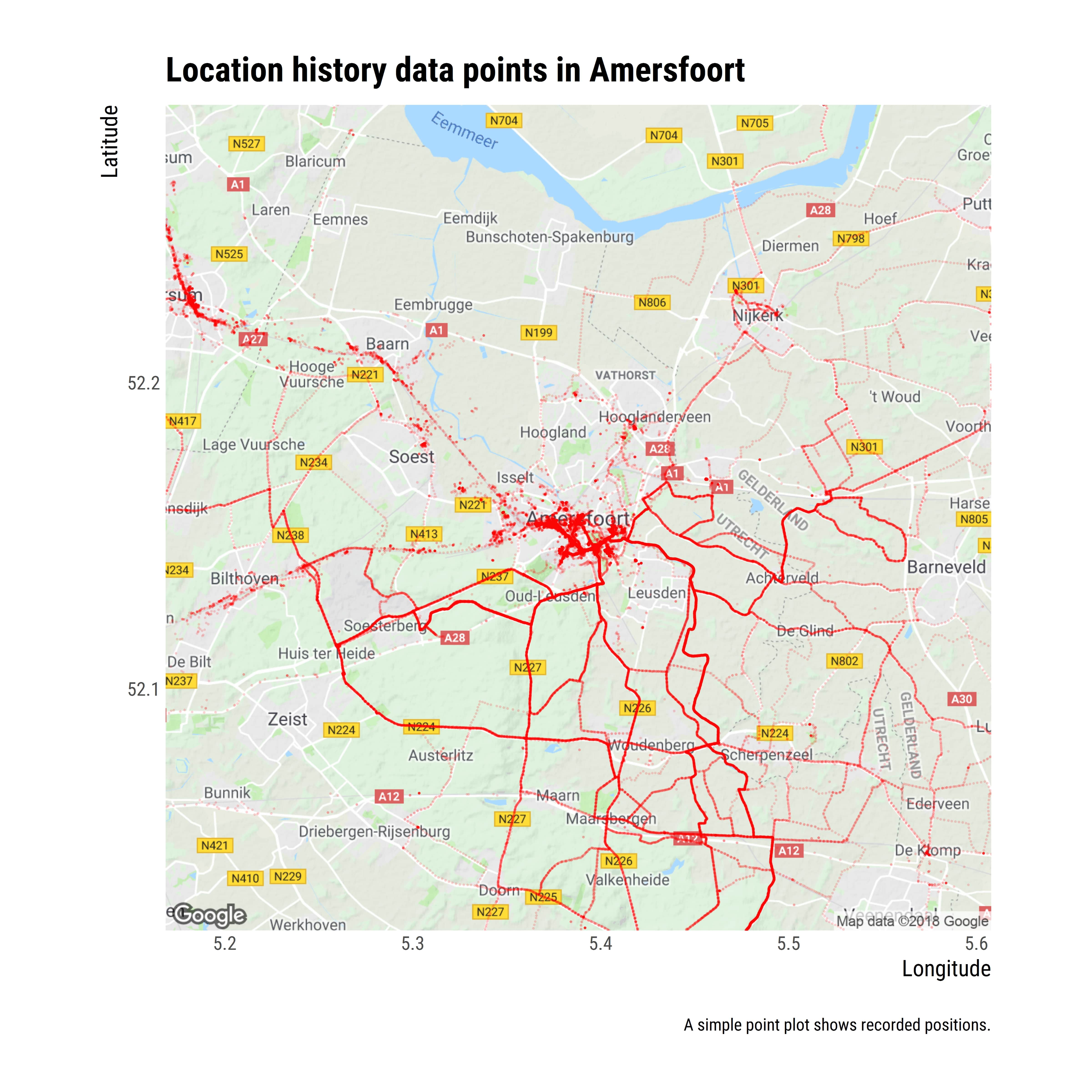
The most interesting part about Google location data is all of the… location data. So let’s see where I have been the past few years. I use the ggmap package to visualise my Google Maps plots.
I live in the Netherlands, in a pretty place called Amersfoort. And I often have to go to other cities in the Netherlands for work. You will also see I often go cycling around the province.
###Locations visited nearby This first plot will show you where I have been according to the Google Location data. Building a map plot is pretty straightforward once you have a proper dataframe with latitude and longitude columns. There are a few steps to go through: * Get the map with a location and zoom level with the get_map function * Create the plot with the ggmap function and overlay your data
#get map from Google Maps
amersfoort <- get_map(location = 'Amersfoort', zoom = 11)

#Generate the plot
ggmap(amersfoort) +
  geom_point(data = df, aes(x = lon, y = lat), alpha = 0.1, color = "red", size=0.2) +
  theme(legend.position = "right") +
  theme_ipsum_rc(grid="Y", axis_text_size=10, axis_title_size = 12)+
  labs(
    x = "Longitude",
    y = "Latitude",
    title = "Location history data points in Amersfoort",
    caption = "\nA simple point plot shows recorded positions.")
Location history data points in Amersfoort
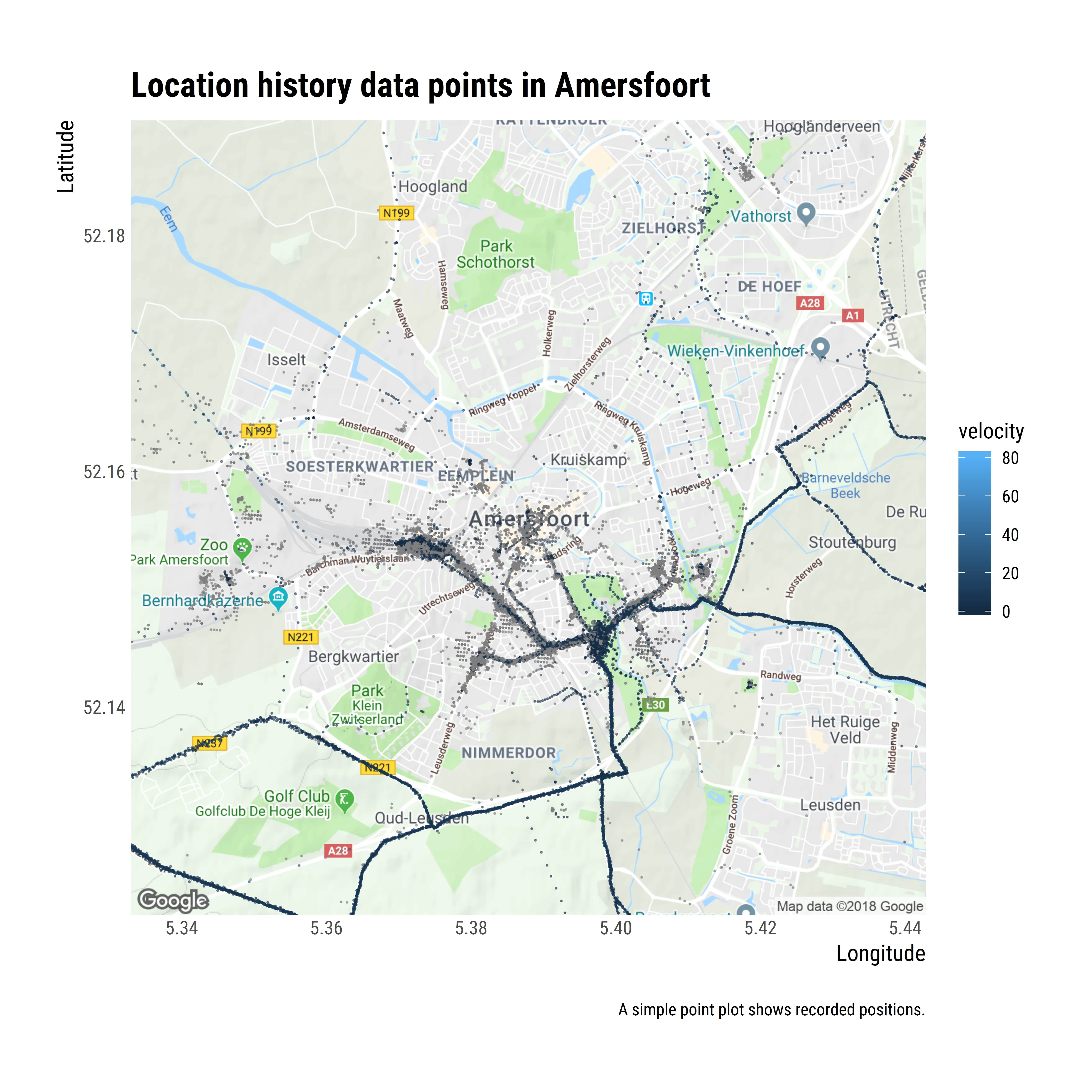
Velocity of travel
I can also visualise something similar to the previous map, but including the page I was travelling in.
ggmap(amersfoort) +
  geom_point(data = df, aes(x = lon, y = lat, color = velocity), alpha = 0.5, size=0.2) +
  theme(legend.position = "right") +
  theme_ipsum_rc(grid="Y", axis_text_size=10, axis_title_size = 12)+
  labs(
    x = "Longitude",
    y = "Latitude",
    title = "Location history data points in Amersfoort",
    caption = "\nA simple point plot shows recorded positions.")
Location history data points in Amersfoort
Conclusion
I might do a followup post in the future on this dataset, because there is a lot of fun stuff in the to discover about my behaviour:
- What’s my average walking pace?
- What are my favorite destinations when cycling?
- Do I walk faster in the morning than the evening?
- When am I most active during the week?